
SP—027 / Beauty & personal care · Visual identity
TINT PARADE
A creative direction for colour cosmetics built around playful swatch arrangements.
Concept projectAn independent creative concept for a fictional brand, not commissioned client work.
The hypothetical brief
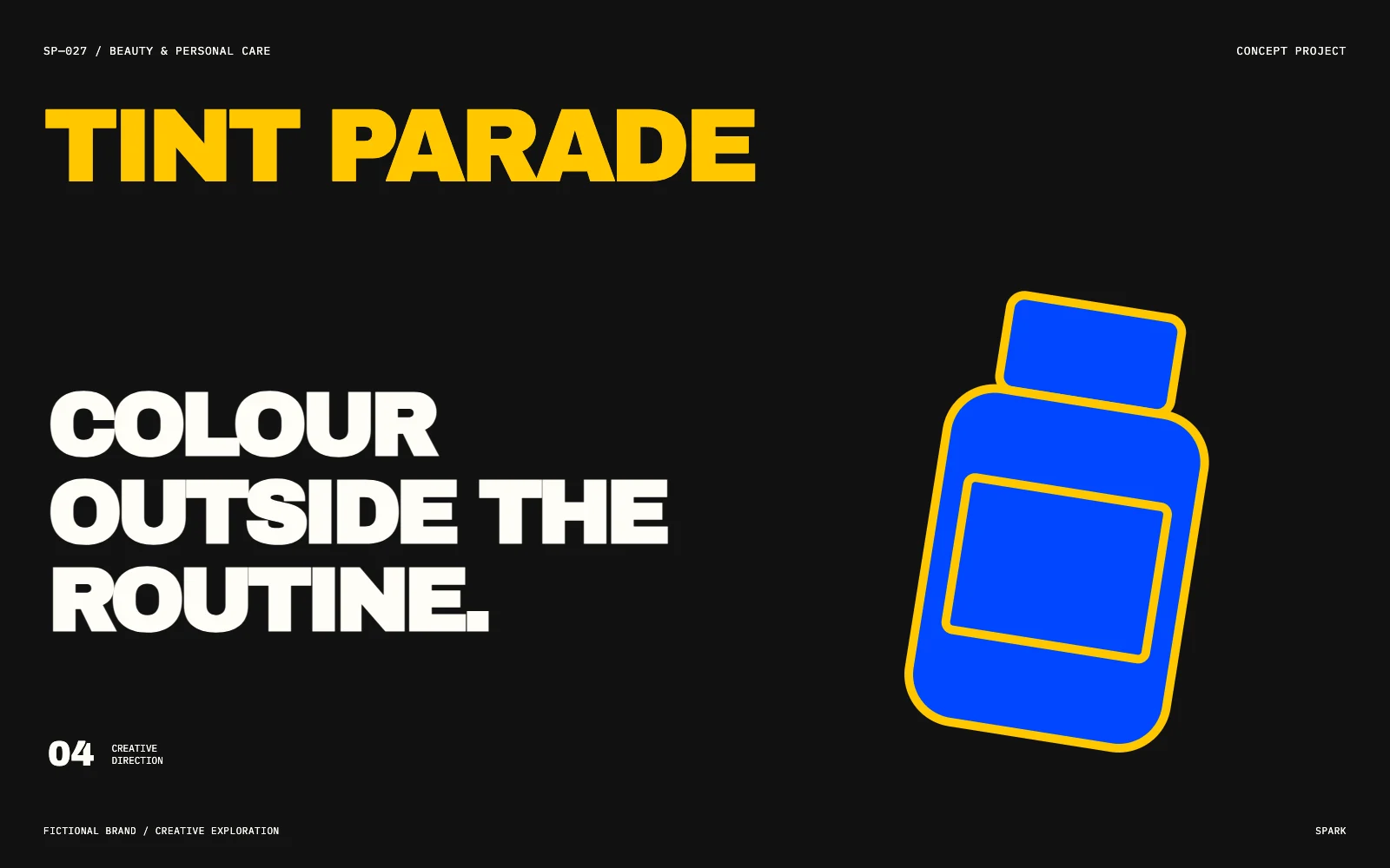
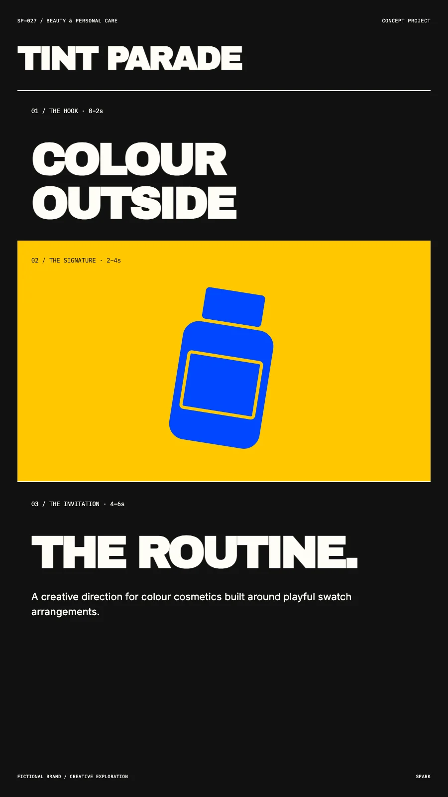
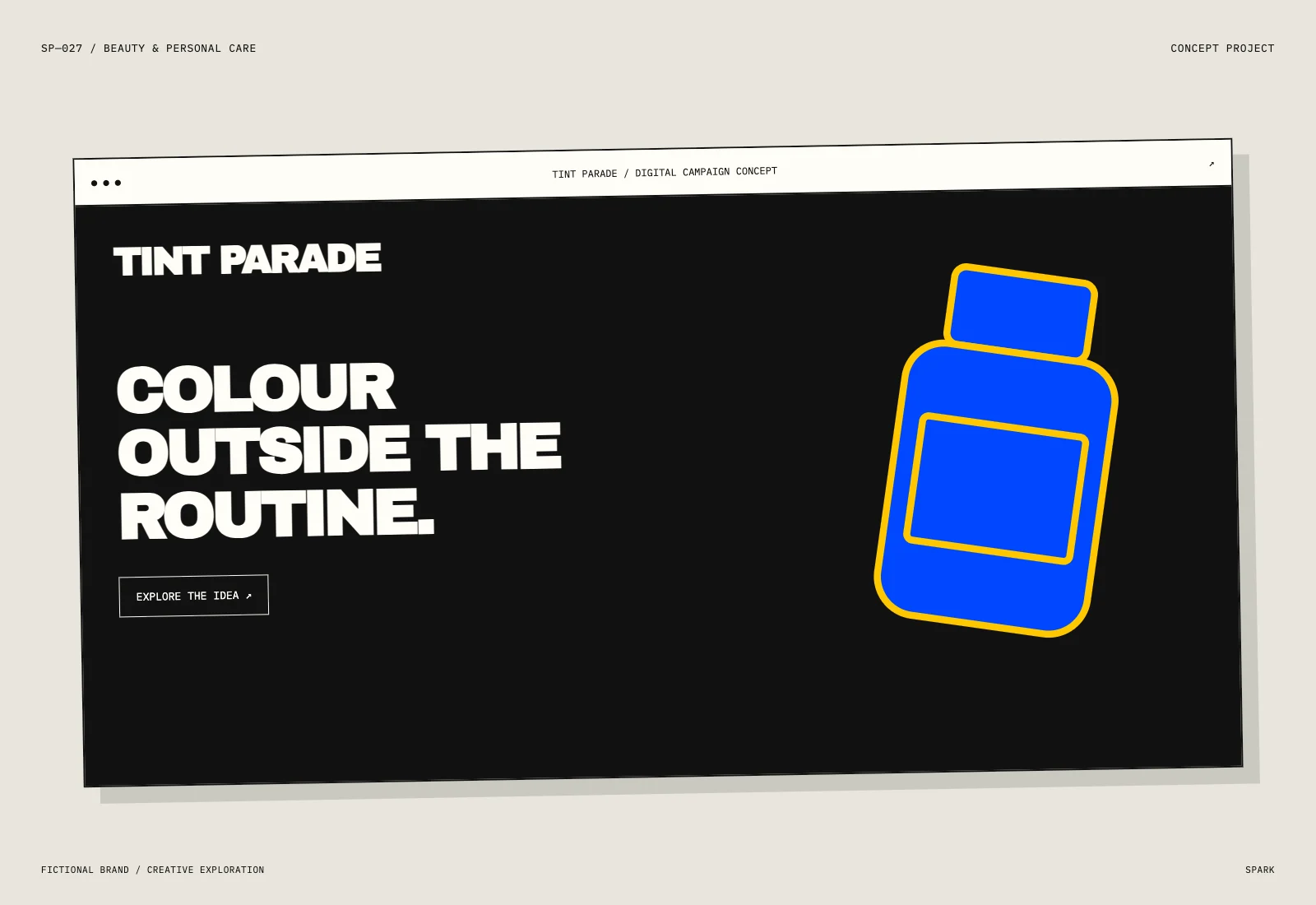
Develop TINT PARADE, a fictional concept for colour cosmetics built around playful swatch arrangements. Overstated product language can obscure a simple, desirable routine. The assignment is to make the proposition distinctive across a campaign poster, a social composition, a motion storyboard and a contextual application.
Who it’s for
People looking for a personal-care ritual that fits their taste and routine.
The strategic idea
“COLOUR OUTSIDE THE ROUTINE.” is the central creative thought. Use a repeatable graphic device to make the brand recognisable before the full message is read. Let texture, packaging and ritual establish desirability. Keep ingredient and efficacy language tied to evidence supplied by the brand.
The creative direction
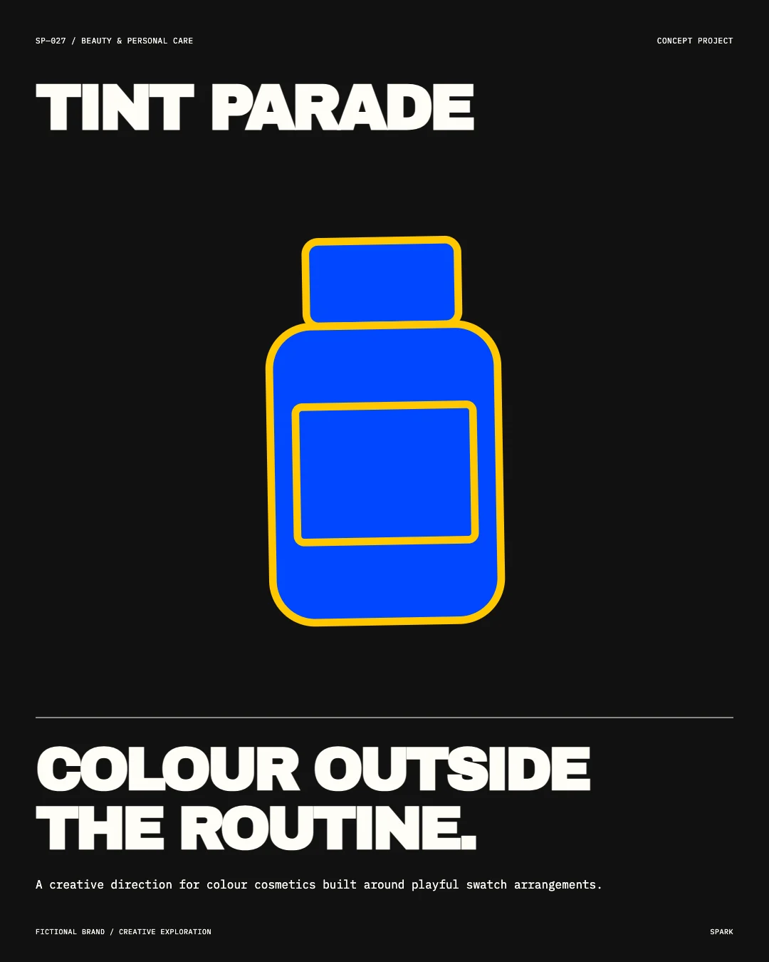
An original bottle-inspired graphic, assertive typography and a #FFC700 colour field create the visual language for TINT PARADE. The four compositions change scale, pacing and framing while retaining the same signature.
This exploration demonstrates creative thinking and craft. It has not run as a live campaign, so no commercial results are claimed.
YOUR BRAND.
A FRESH ANGLE.
Let’s build something grounded in your audience, your offer and your next move.
Talk about your project